The Painter's Palette: When Color Is Felt, Not Seen
My client came to me with a vision: sophisticated, elegant, something that bridged the distance between New York and Paris. She had colors picked out before we even began, the kind of palette you'd expect from that brief. Safe. Refined. Predictable.
But when we sat down to talk about how she actually wanted to feel in her home, we started asking different questions. Not "what colors do you like?" but "what does sophistication feel like to you?" Not "what's trending?" but "when you imagine coming home at the end of the day, what do you want the space to give you?"
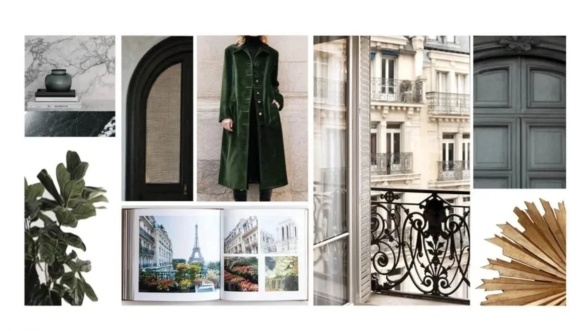
She talked about Parisian apartments at dusk, the way light filters through iron balconies. She mentioned the weight of velvet, the patina of old books, the mystery of a room you discover slowly rather than take in at a glance. She wanted depth. Layers. A home that revealed itself over time.
Her palette evolved, deepened really, into something far moodier and more jewel-toned than either of us initially expected. And that's when I understood what I've come to believe about color in design: we're not simply selecting color from a chart. We're artists, composing emotion, translating the intangible into something you can see and feel.
The Gap Between Knowing and Feeling
Here's what's interesting about color psychology, we all know that red means passion, that blue is calming, that green connects us to nature. We can recite these associations like facts. Red increases heart rate. Yellow evokes optimism. Purple signals luxury because it was once reserved for emperors, yada, yada, yada.
But knowing what colors mean and understanding how to use them are entirely different things.
When my client said "sophisticated," she could have meant crisp whites and soft grays, that glossy magazine version of elegance. But what sophistication actually felt like to her was something richer, more saturated, more complex. It was the difference between describing a painting and standing in front of it.
The mood board we created told the real story: deep forest green velvet against weathered Parisian stone, ornate ironwork casting shadows, marble veined with gray and gold, the aged patina of vintage photographs. This wasn't about individual colors. It was about a mood: literary, Old World, intimate.
Translating Mood into Palette
Once we understood the feeling, the colors became obvious. Not easy, obvious. There's a difference.
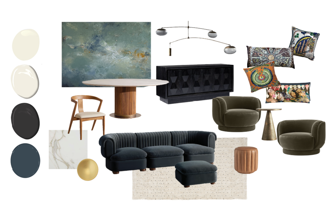
We landed on a palette of inky charcoals and slate blues and mossy forest greens, the kind that shift depending on the light. Deep emerald green that feels both jewel-like and organic. Warmth came through in caramel leather and brushed brass, never veering into cheerfulness but adding a necessary glow. And then those jewel-toned pillows with their ornate patterns, sapphire, amber, deep rose, like finding treasure in a dimly lit room.
The abstract painting we selected became the anchor: stormy blues with unexpected flashes of gold, moody and layered and impossible to take in all at once. Exactly like the feeling she wanted.
Here's what each color brought to the emotional composition:
The deep blues and charcoals created that sense of enclosure and intimacy she craved, not in a claustrophobic way, but in the way twilight feels protective. Blue has always been associated with calmness and trust, going back to ancient Greece where it represented the gods. But this wasn't spa-blue tranquility. This was the blue of a velvet theater curtain, sophisticated and enveloping.
The mossy green grounded everything in richness. Green connects us to nature and renewal, yes, think of a verdant garden in spring. But this particular green was more like the color of old money, of velvet coats and private clubs. It brought that sense of permanence and weight she associated with Parisian elegance.
The warm metallics and caramels kept the space from disappearing into darkness. They caught light, created moments of warmth, suggested intimacy rather than isolation. Gold and brass have always signified luxury and power, but used sparingly, they become punctuation marks, places for the eye to rest and the mood to lift slightly before sinking back into those deeper tones.
The jewel tones in the textiles added complexity and surprise. This is where we could play with that entire spectrum of rich color. Each one a small moment of intensity against the moodier backdrop. These are our happy little clouds, those small moments of brightness and texture that Bob Ross knew made all the difference in a painting.
What made it work wasn't that we followed the rules of color psychology. It's that we understood the why behind those associations and used them intentionally.
The Colors We Think We Want
Clients often come in with ideas about what their colors should be based on what they think those colors mean or what they've seen work elsewhere. But those choices are often intellectual rather than emotional. They're based on "sophisticated spaces use neutrals" or "calming bedrooms are always blue" rather than "this is exactly how I want to feel."
The truth is, any color can evoke any emotion depending on how you use it. Red isn't just passion and danger, it can be grounding and warm when it's the red of terracotta or barn wood. White isn't just pure and clean, it can feel cold and empty, or it can feel spacious and serene. Yellow might be sunshine and optimism in one context and caution and anxiety in another.
The associations we have with color, red for love and anger, orange for creativity, green for growth, purple for luxury, these aren't arbitrary. They come from centuries of human experience, from the natural world, from cultural meaning. But these are starting points, not prescriptions. The art is in understanding how a color behaves in a specific context, next to specific other colors, in a specific quality of light, in service of a specific feeling.
Building Your Own Palette
So how do you move from knowing what colors mean to actually composing with them?
Start with the feeling, not the color. Ask yourself: When I'm in this space, what do I want it to give me? Energy or calm? Intimacy or expansiveness? Warmth or cool sophistication? Don't think about individual colors yet, think about the experience.
Then find your references. What places, objects, artworks, or moments in time evoke that feeling for you? Create a mood board, even if it's just images saved on your phone. Let yourself be surprised by what appears. My client didn't start out thinking "dark jewel tones," but once we looked at what actually created that feeling of Parisian sophistication for her, the colors revealed themselves.
Pay attention to context and proportion. A color that feels overwhelming on every wall might be perfect as an accent. A combination that seems too dark in a small sample can feel enveloping and luxurious in a full room with the right lighting. This is where the painter's eye comes in, knowing not just what colors to use, but how much, where, and next to what.
And finally, trust the evolution. The palette my client ended up with was nothing like what she initially had in mind, but it was exactly what she needed to create the feeling she wanted. Sometimes the colors we think we want are just placeholders until we figure out what we're actually trying to say.
Color as Conversation
In the end, designing with color is a lot like any creative act. You're not just applying technique—you're having a conversation between intention and intuition, between what you know and what you feel, between the meaning that's been given to you and the meaning you want to create.
The psychology of color gives us a vocabulary. It tells us why humans across cultures associate blue with calm and red with intensity, why green makes us think of growth and black conveys power. This knowledge matters. It's the foundation.
But the artistry is in how you use that vocabulary to say something specific, something true to the person who will live in the space. It's in knowing when to whisper and when to make a statement, when to follow convention and when to subvert it completely. It's in knowing where to place your happy little clouds.
My client's home didn't end up looking like "sophisticated New York meets Paris" in any obvious way. It looked like her version of that, deeper, moodier, more layered than the idea suggested. The colors didn't just support the mood. They became it.
That's what happens when you stop thinking of color as decoration and start thinking of it as emotion made visible. When you approach your palette the way a painter approaches a canvas, not asking "what should I use?" but "what am I trying to say?"
The colors are already there, waiting. You just have to learn to speak their language.