Paint Your Way To #EverydayBeautiful
Careless Whispers, Arsenic, Snugglepuss, Dead Salmon, Spill the Wine, Mouse’s Back…No these are not rock-n-roll songs or band names. These are paint color names. Seriously, "mouse's back" is lovely.
Selecting paint colors for your home can be as impossible as understanding how they get their names. But as you can see, those that create paint colors have fun with it and so can we.
We have some ideas on how to make the process of choosing the perfect color scheme a little less daunting. With a little inspiration, some time and focus, you can create a beautiful and cohesive color palette that reflects your personal style and enhances the overall aesthetic of your home.
Here are some tips to inspire your painted masterpiece:
Try to Catch a Vibe:
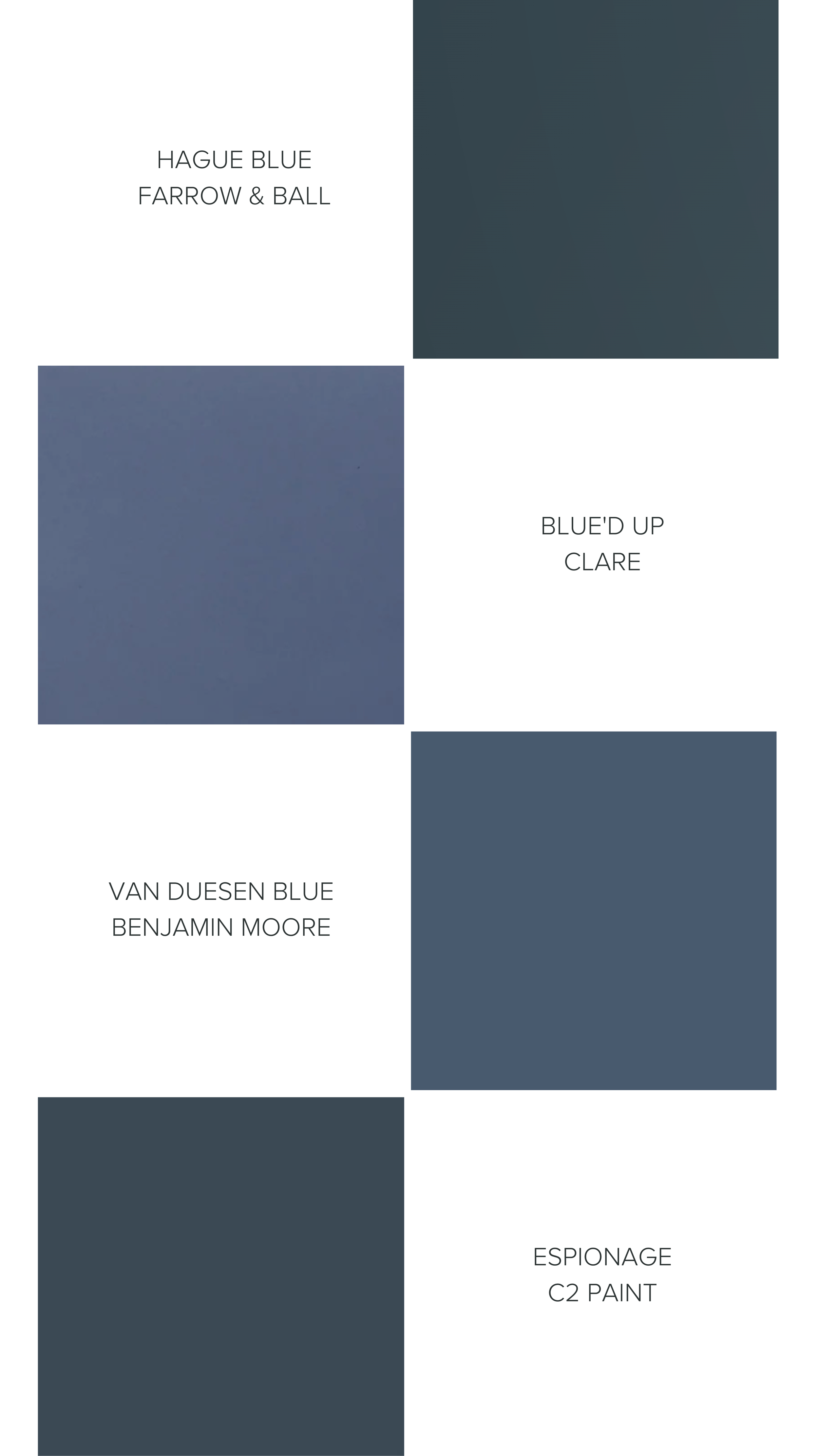
Calm and relaxed, vibrant and energetic? What is the purpose of the space and how do you want to feel? Different colors can evoke different emotions, so choose colors that align with the mood you want to create. A client recently hired us to redo her toddler’s bedroom. It’s a south facing room that gets a lot of mid-day and late afternoon sun. There is an attached ensuite with blue tiles that guided us to lean into the blues for the bedroom pain. We pulled five appropriate samples and brought them into the space to narrow down our choices. When all was said and done, we selected a deep dark Blue’d Up by Clare paint.
Highlight Your Best Features:
Look to the colors in your existing furniture, artwork, and decor for inspiration. A rug, throw pillow, or piece of art can provide a great starting point for selecting paint colors. One of the tricks I like to employ when a client is unsure of the direction for a color palette, is to ask clients for favorite photos or images that depict the mood they want in their space. Then we pull out the color palette from that image to begin the discussion.
Observe the Light:
Colors change with the quality of light. Natural light can have a significant impact on the way colors appear. Consider the amount and direction of natural light in each room when selecting paint colors. For example, north-facing rooms tend to have cooler light, so warmer colors can help make the space feel more inviting. This is especially important with “white” colors. It seems that selecting a white should be easy…it’s not. There are rarely pure white paints, and in fact most colors have undertones of various hues, grey, yellow, pink, green. Make sure to follow our next tip to check your paint colors in the space as the warm and cool undertones in paint can be more pronounced in different lighting.
Test Before Your Commit:
Remember how we just mentioned colors change with different light? Well the last thing you want to do is fall in love with a color, paint your whole house and find out the light changes it completely.
Before deciding a long-lasting relationship with a color, test it in your space. There are two ways of testing: you can ask for a “drawdown”, that is a piece of card stock or board that is painted with the exact color and finish of the paint you have selected. And the second is to paint a sample swatch on a wall in each space.
Either option is fine. What is most important is to observe how the paint colors look throughout the day in different lighting conditions. This will give you a better sense of how the color will look, and change, within your space.
Choose Colorful Friends:
When choosing colors, you want to think about the overall palette of your home, as well as each individual room color. Select a color palette that flows from room to room. This doesn't mean that every room needs to be the same color, but rather that the colors you choose work well together and complement each other…like the perfect group of friends vacationing together. If you select cool sage green for a room, then you would select complimentary color tones for adjoining rooms. And in this case, bringing the drawdowns into each space to observe them together is important to see how the colors change when next to each other. has meaning and evokes emotions. Now that we’ve empowered you with tips to make your paint selection process less intimidating, here are some #everydaybeautiful paint color ideas to inspire you
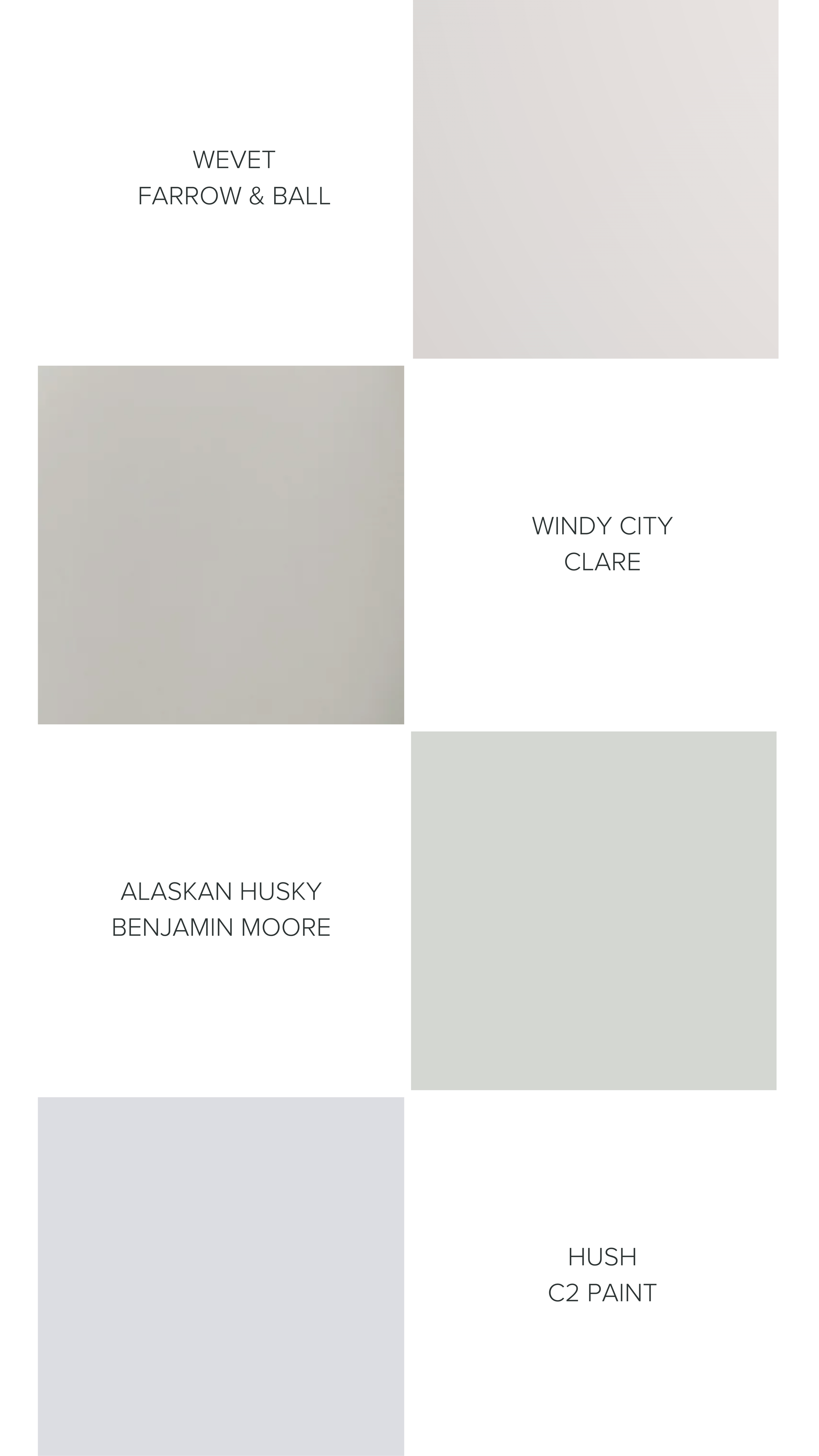
Soft gray:
A soft gray is a timeless and versatile color that works well in any room. It provides a neutral backdrop that allows other colors and textures to pop. May we suggest a brown gray such as Mouse’s Back from Farrow and Ball? If you want an even softer grey tone, then we love Farrow & Ball’s Wevet too.
Deep blues:
Dark deep sultry blues add depth and drama to a space. And contrary to popular opinion, deep dark colors do not always make a room appear smaller. Give yourself permission to break free of the old ideas and embrace a dark color in a dining room, or paint an entire powder room, including ceiling for a dramatic impression.
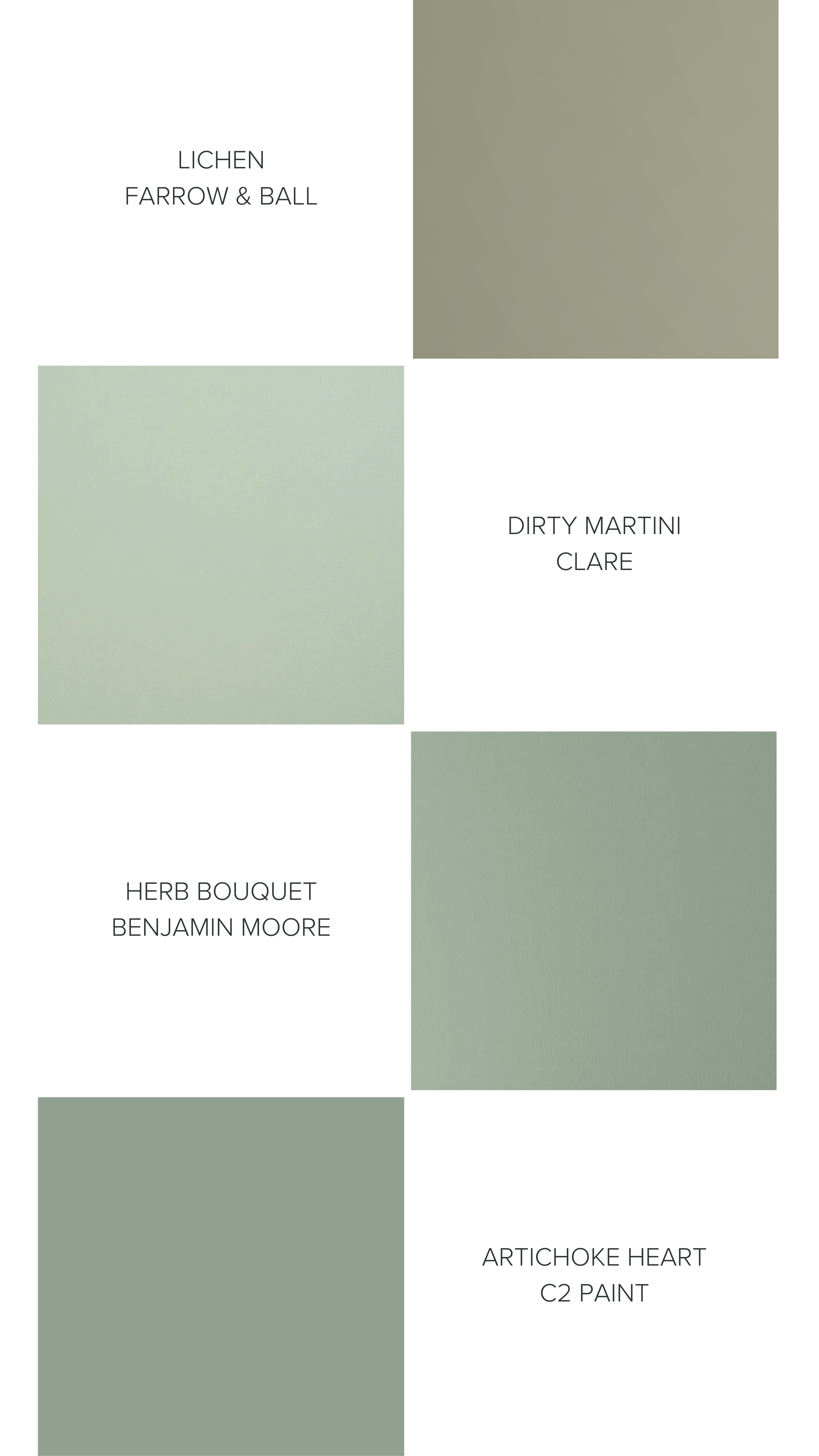
Sage green:
Calm and soothing, sage green works well in bedrooms and living rooms. It pairs well with natural wood accents and earthy textures for a cozy boho-gypset or Jungalow vibe.
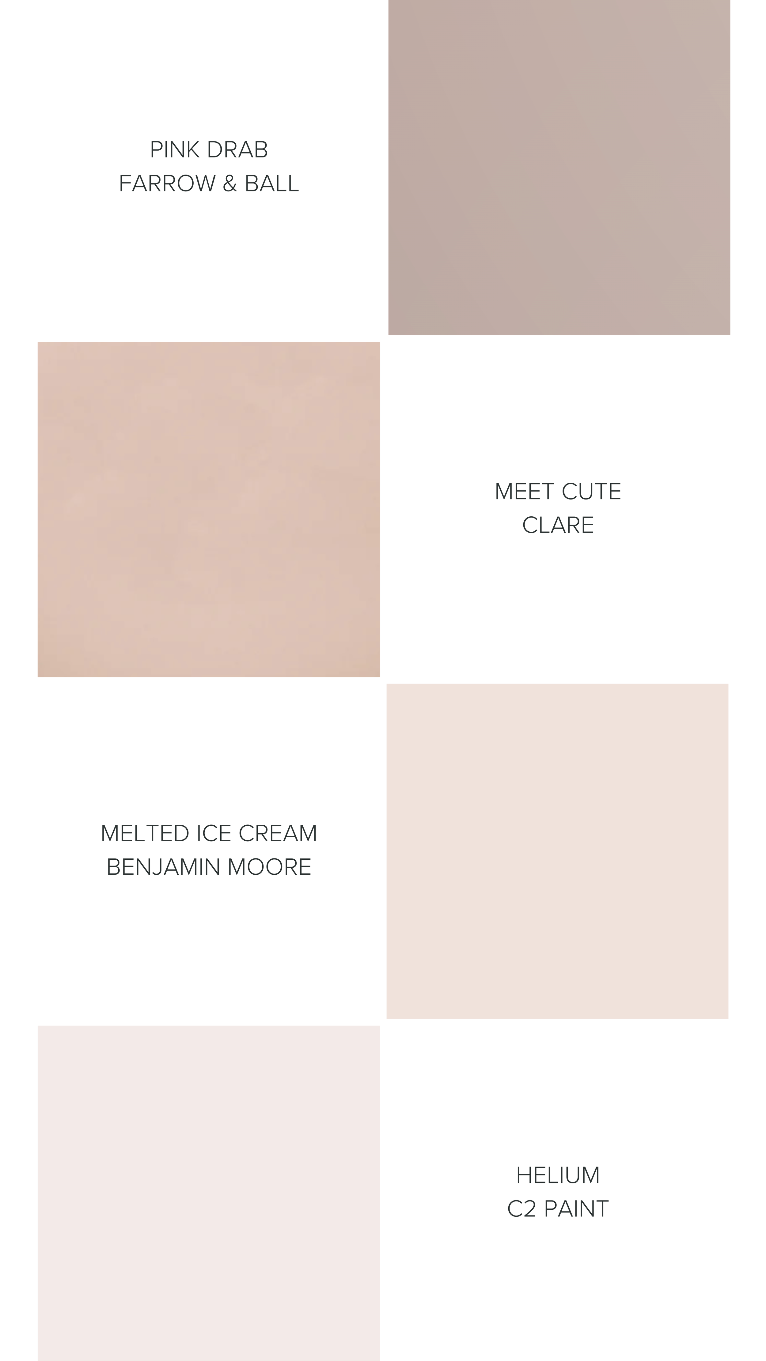
Blush pink:
Soft and warm, blush colors add a touch of elegance to any space. We’re not talking barbie hot pink, this is a sophisticated yet gentle color that is lovely on its own or as an accent. It is also universally flattering in powder rooms.
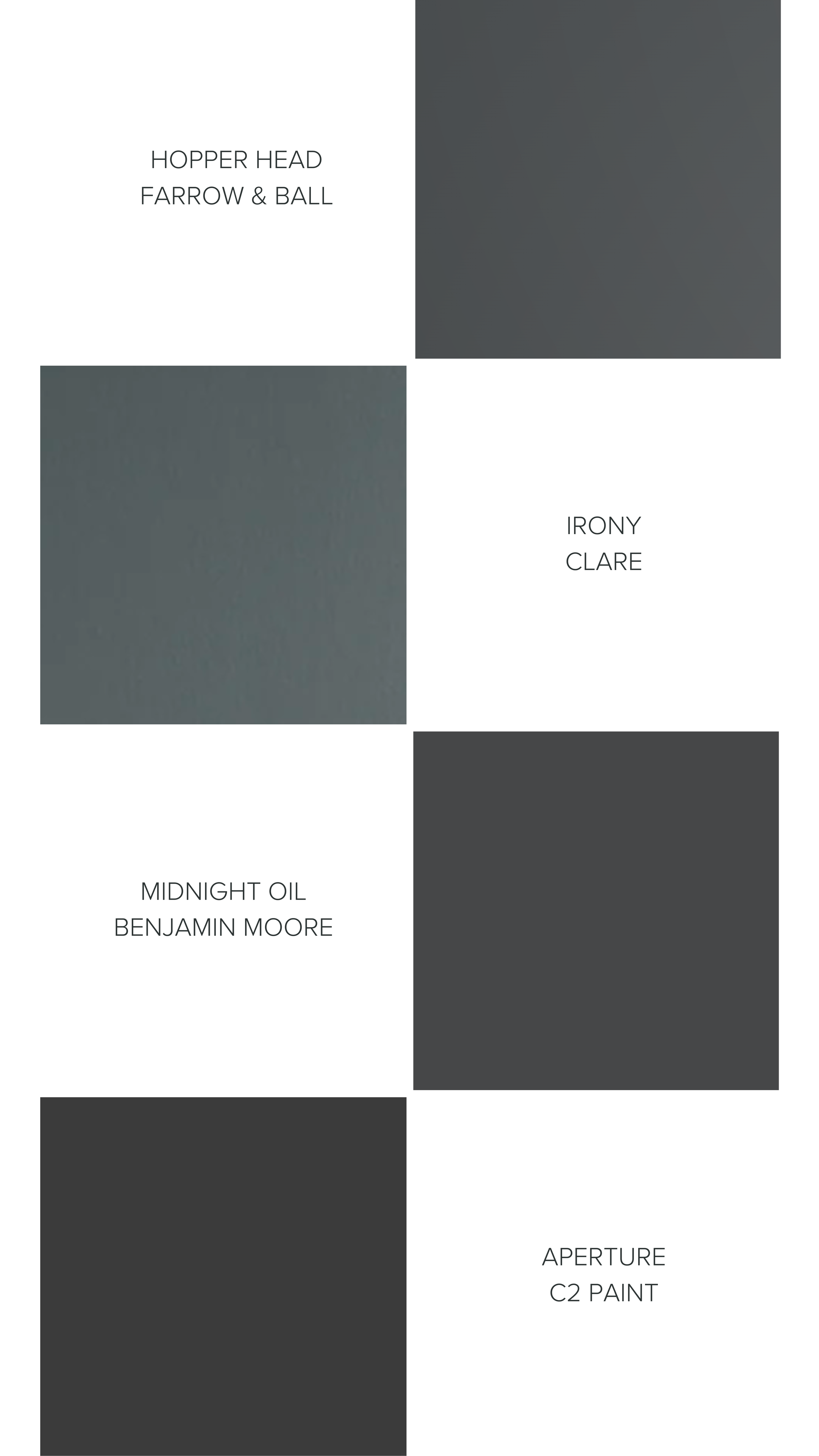
Charcoal gray:
Bold and dramatic, elegant color that adds depth and contrast to a space.
Let your inner Picasso out! Creating a paint palette can be an enjoyable creative process. Take the time to consider the mood you want to evoke, highlight your surroundings, observe the natural light, and consider how the colors will play together to create a cohesive aesthetic feel in your space. Once you have your selections, test the colors in your space to make sure they work long-term.
Then it's time to get to work creating your artistic masterpiece.